

Ntooitive Internship: Sales/Ops Collaboration Tools Redesign
A sneak peek into some of the work I did during my first UX internship

Highlights
Overview
Role: UX Researcher, Product Designer
Timeline: June - Aug 2019 (10 weeks)
Tools: SurveyMonkey, Figma, Trello, and lots of post-its!
Team: I collaborated with the PMs, Marketing Director, Graphic Designer, Engineers, sales/operation teams as well as the CEO and CTO.
Deliverables: High fidelity Mockups, Prototypes
. . .
The Challenge
Ntooitive’s tools are designed to tackle the inefficiency of digital marketing and advertising requests through provision of automation tools that help sales and operations teams to collaboratively resolve requests. Ntooitive’s current software provides most of the necessary features, however, some of the tools’ most powerful features either remain unused, unknown or misunderstood in capability due to design that involves more than necessary clicks, unorganized information, lack of responsiveness, and a gap between the system’s functionality and end users’ mental models. This creates inefficiency leading to an unnecessary increase in time on task.
How might we redesign the collaboration feature so as to increase task efficiency and maximize productivity of sales and operations teams?
The Solution
In order to collaborate effectively, sales teams need access to relevant details their fingertips, ability to provide documents/creatives and means of communication with people involved quickly and easily. The data-driven redesigns condensed a majority of the system’s functionality and features onto one frame so as to allow users to be able to reference relevant information and be able to work with it simply, thereby maximizing productivity and reducing time on task. Some of the features include ability to send messages, attach documents, create reminders, add notes and manage tickets. The designs have been handed off to developers and are currently under implementation. Unfortunately, I’m not allowed to share the designs publicly. If you have any questions or would like to know more, feel free to reach out to me at apnathan@uci.edu.
Process Overview

. . .
Research
Competitive Analysis
I first looked into and read about the following competitors in order to understand the market, bring myself on board to understand how business works and determine the business and user value brought through the services we provide.

Interviews + Usability Testing
I spent some time tinkering with the tools created by the company and asking my team questions to understand how the tools interact with one another as well as the user. Having noticed some inefficiencies in the workflow, I discerned that we needed to get insights into their thought process and observe their workflow to identify major pain points. Along with my manager and team, I identified key interface features that we wanted to look into with users and came up with a moderated usability test script + interview questions. Some of the questions that I asked included:
Walk me through your process of creating an order.
Do you refer to any documents or rely on other software tools to complete ___ process?
Which information do you reference while interacting with other stakeholders on the system?
What are some decisions you make using the data that is displayed?
Surveys
In addition to interviews and usability tests, I wanted to gain a quantitative understanding of users’ perception of the tool. I identified specific questions and developed a survey using SurveyMonkey that would give me numerical insights. This data, combined with the qualitative responses from interviews/usability test allowed me to verify and explain qualitative information, put answers into perspective, and give my team food for thought and discussion.
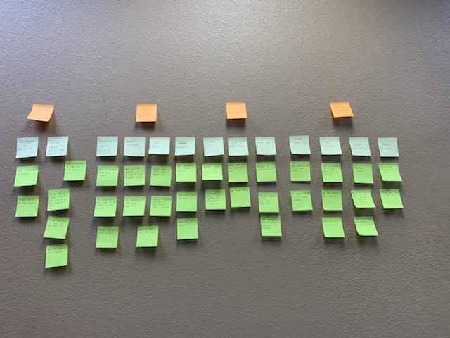
Affinity Diagramming
In order to make sense of the large amount of qualitative responses, I spent time filtering out the information, condensing what appeared relevant and finding patterns among responses. Being a solo UXer, making sense of the information was challenging so I encouraged my team to jump in and become up, close and personal with users’ responses.


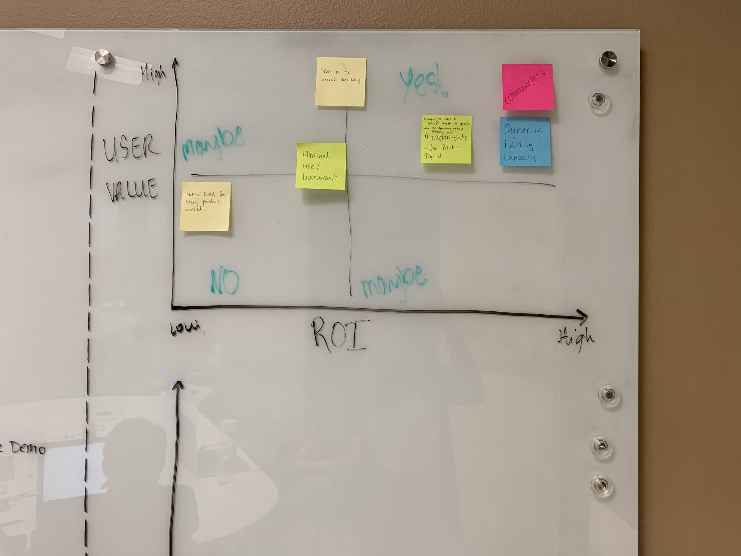
Dot voting
Due to a large number of areas of improvement in the interface and limited time, I wanted to narrow down my focus to designing what would be most essential. In order to make a collaborative decision and try out a new method of prioritizing what needs work, I implemented the dot voting technique with my team.

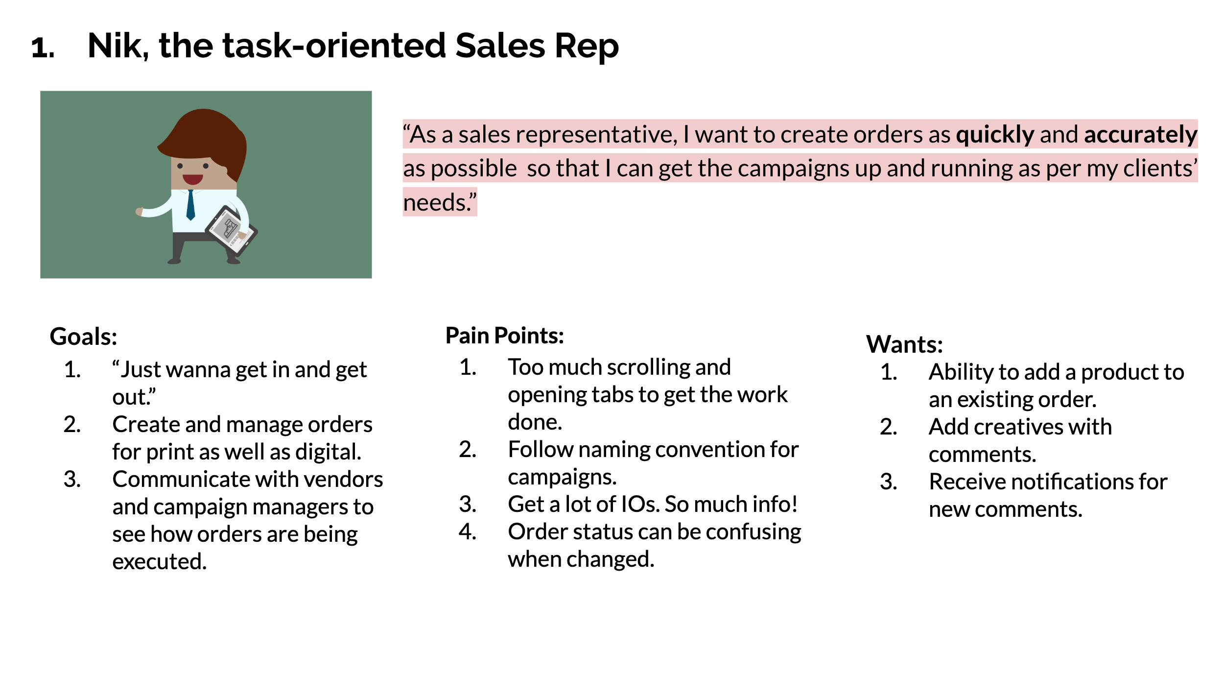
Personas
Given that there are different roles of people using the tools, I wanted to create personas that help me as well as the my team empathize and understand goals, pain points and wants of people using our products.


. . .
Design
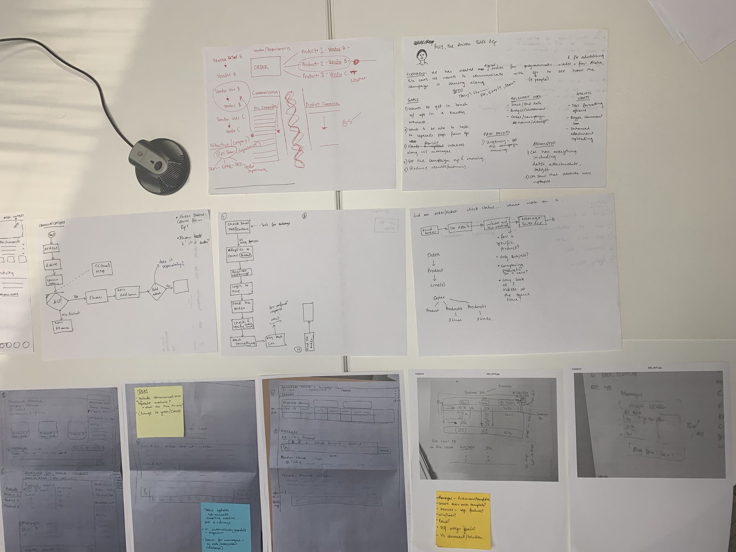
Journey mapping
Putting ourselves in the users’ shoes required going through their stepwise process of performing different tasks under different scenarios. I created multiple task flow diagrams for various use cases of the tools.

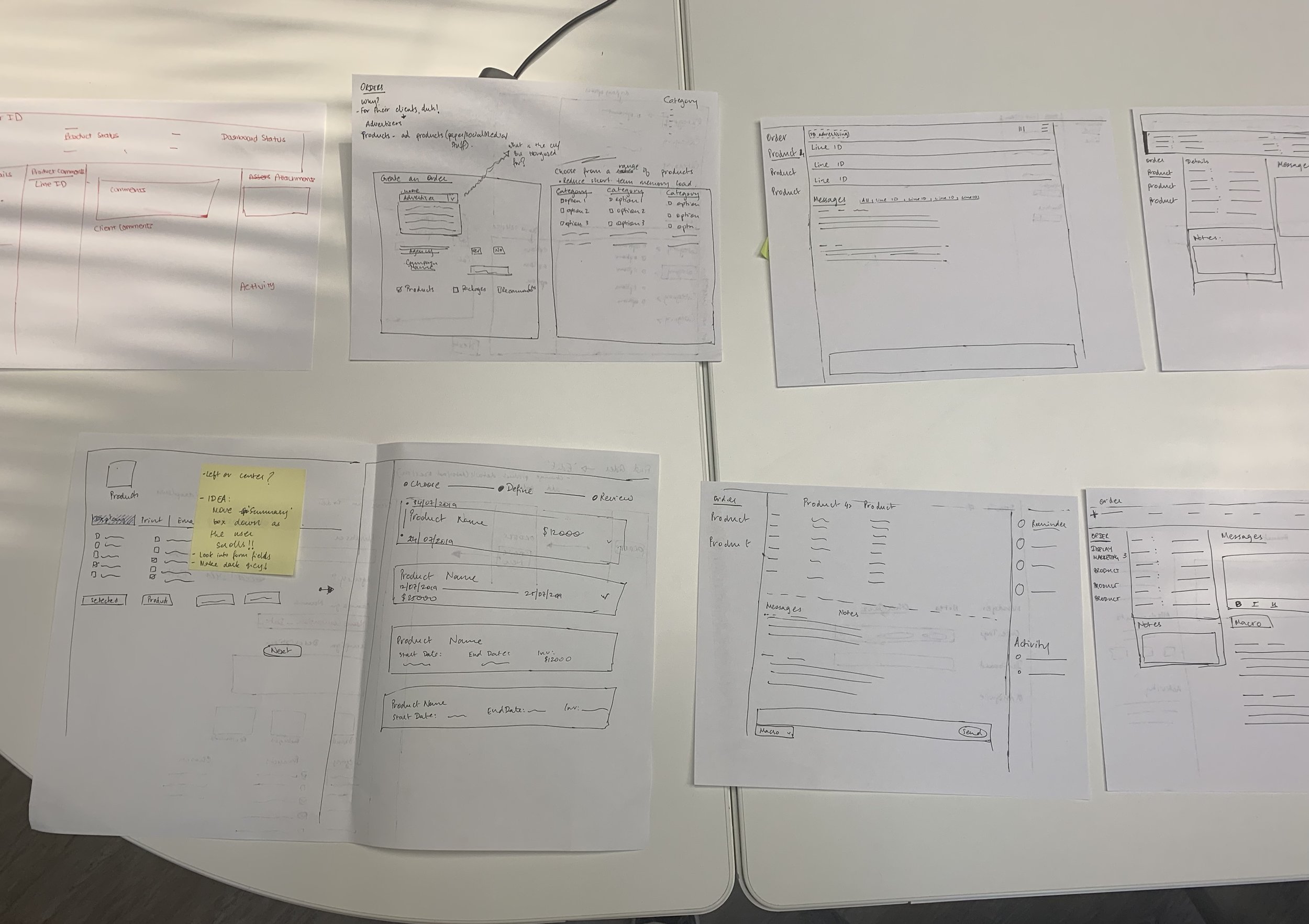
Sketching
Multiple scenarios and use cases demanded exploration of a variety of ways to address the problems. Sketching allowed me to create alternatives, explore different ways to address users’ pain points early on and discuss ideas with team members. I invited the marketing director and other product team members to dabble in brainstorming solutions together so that we could bounce ideas quickly and efficiently.


Introducing figma
So far, the company was using Adobe Illustrator to create UX/UI mockups. Having a UX background and knowing the power of design+prototyping tools such as Sketch, Figma, and XD for creating as well as testing designs, I figured it would be a good idea to introduce a dedicated design tool to the company. I had a conversation with my managers and explained the advantages of using a design tool in terms of collaboration, developer handoff and design specific advantages like components. My managers were convinced and bought the professional Figma subscription right away :)
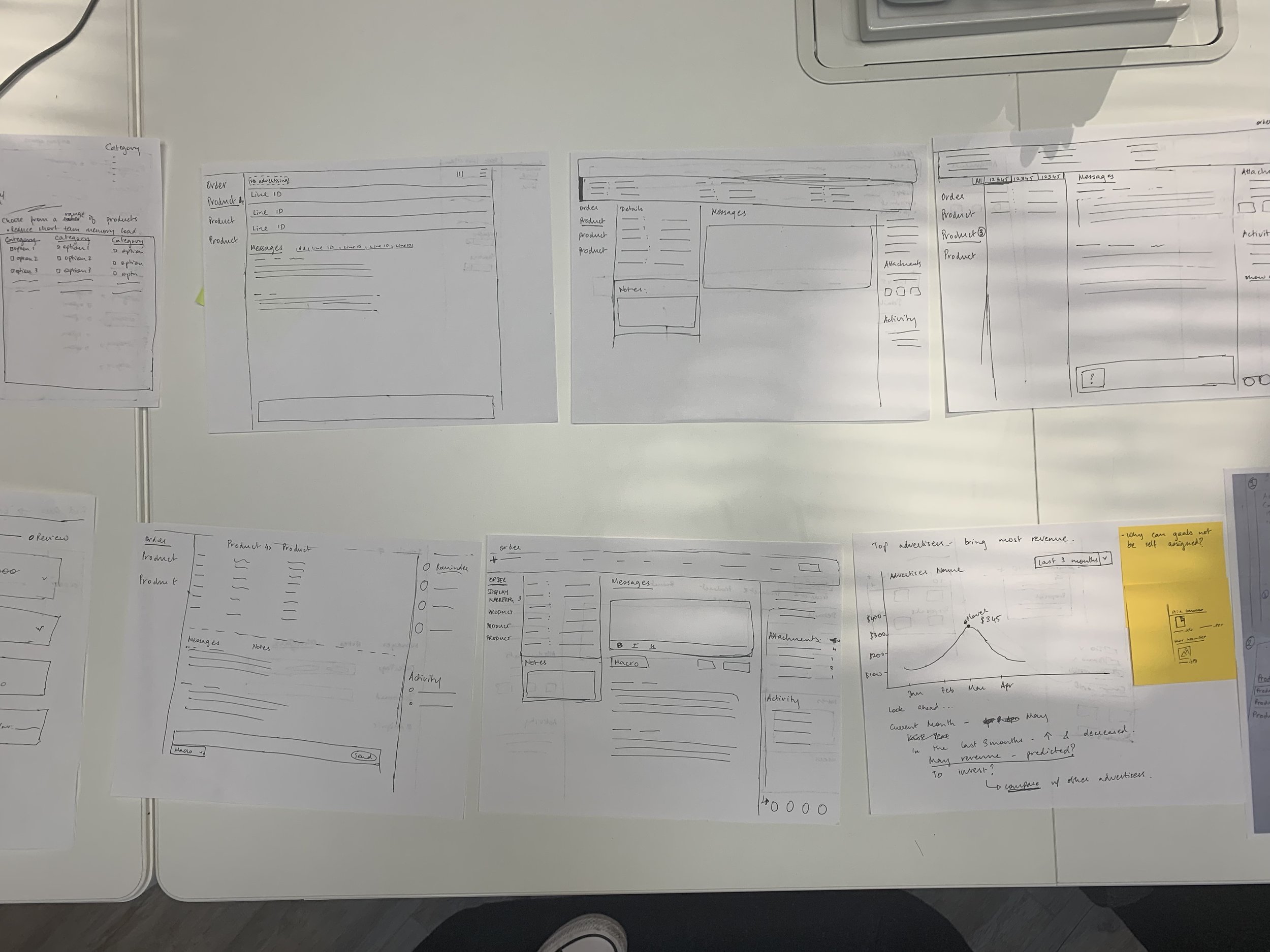
Wireframes and concept testing
Having received early feedback, explored ideas and ruled out what would/wouldn’t work, wireframing based on task workflow became much easier. I created prototypes and used these to present and receive feedback on potential redesigns with users and stakeholders sooner in the process so that making changes would be less taxing after the designs were jazzed up.

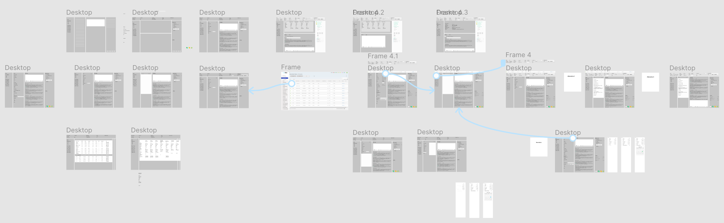
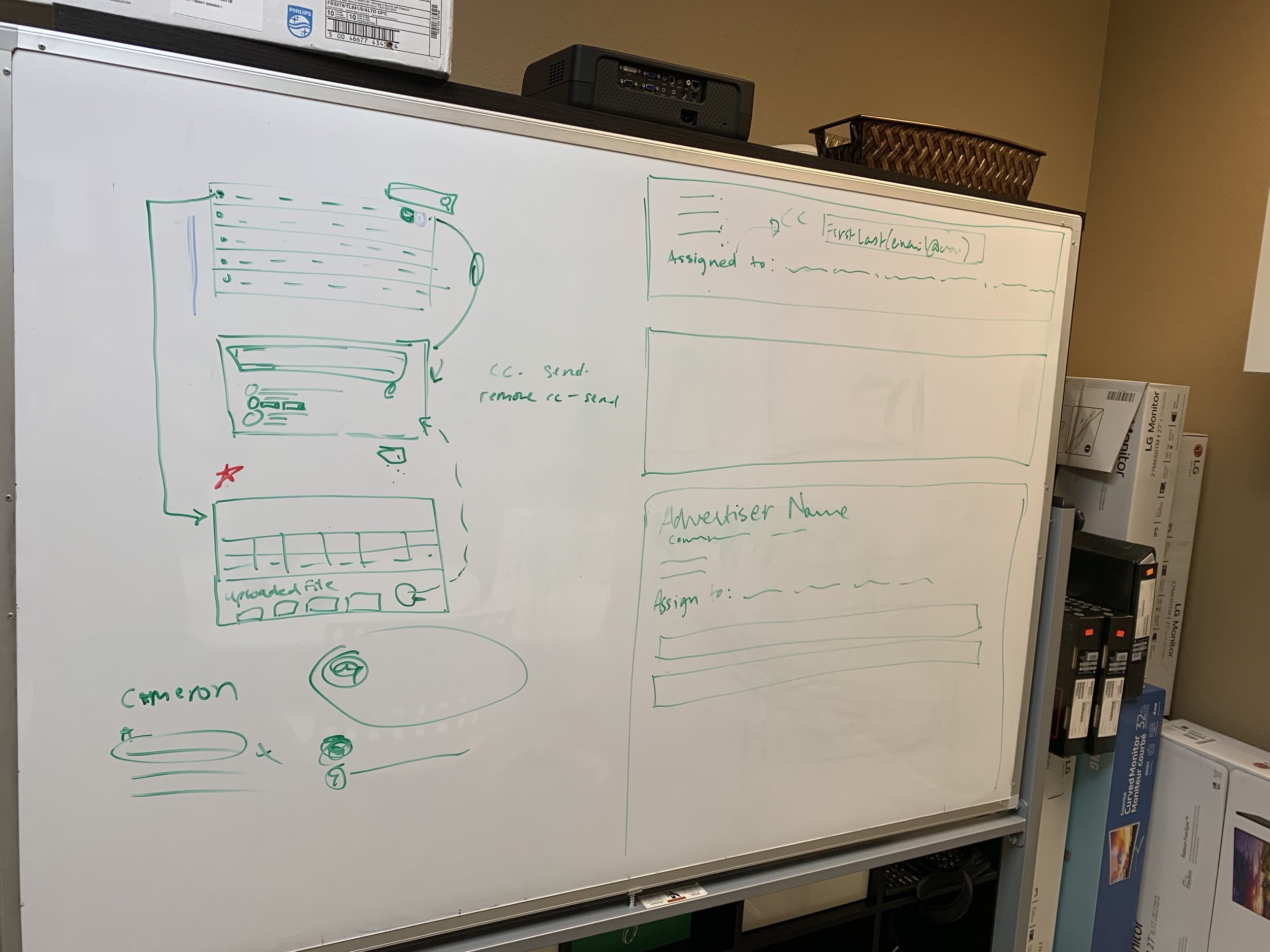
Iteration and Mockups
Once we had settled on a design alternative that everyone agreed upon, I made changes based on the feedback and moved on to experimenting with styles, colors, type and interactive details. The startup environment gave me the flexibility to try different things, question previously used styles, suggest ideas and apply new styles to designs. Unfortunately, I am unable to share any detailed work here but I’ve included some design specifics that I thought about, researched and experimented with.
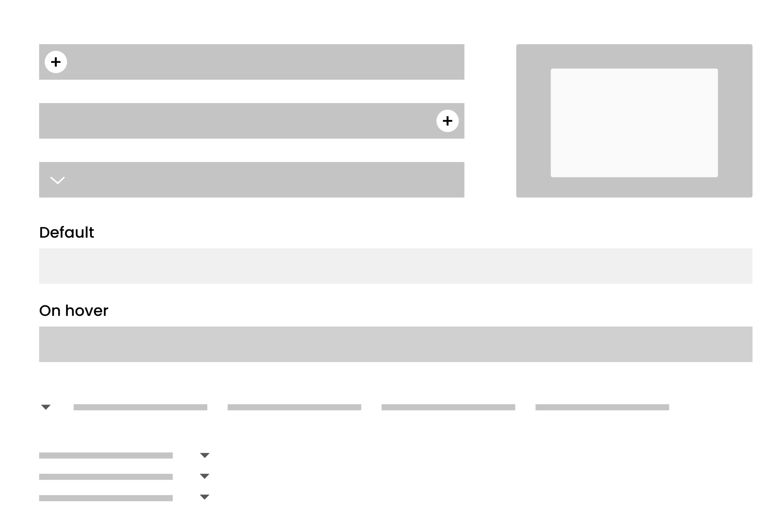
Accordion vs. Modal box
Does clicking on a table row, pull up a new window or reveal more detail to work with underneath? It’s like asking do we want to open a door to go into another room or open a wardrobe in the same room to reveal more? Pinning into the human subconscious to make an interface design choice was essential to determine behavior and animation style.
Vertical vs. horizontal display of details
Should the large amount of data be displayed horizontally such that users have to scroll right/left to read it all? Or should it be displayed vertically so it can be scrolled vertically? Is there a way we can provide both options to the user? What works best for different user scenarios? for desktop vs. mobile interfaces?
Adding/ choosing new features
Insights collected from user research allowed us to identify and introduce new features that could be added not only to the collaboration and management feature but the tools as a whole. Creating features that are evidence-based, beautiful as well as functional, allowed us to align with the company’s mission of creating “a better way to efficiency.”


Icons
Iconography is something that had fascinated me for a while but didn’t have the chance to explore until this internship. I was excited as I found myself thinking about ideas for the best visual representation of actions and putting together shapes, colors, and layout of icons. Diving into the human mind and commonly used software to recognize symbols that are familiar helped me create icons that are easily understood by the users.
Fonts
I dived into learning and applying some knowledge and ideas of typography. Understanding how a font gives insight into overall brand personality, determining when, why and how to use font pairings and exploring the world of type was fun and helped me grasp the emotional connection we were making with users.

. . .
Testing
I moderated user and stakeholder feedback sessions by presenting mockups, sharing whys behind design decisions, receiving critiques and getting a deeper insight into workflow details of smaller tasks. For most feedback sessions, I had to make sure to ask the right questions and sometimes allow users to participate in brainstorming ideas to come up with solutions based on their usage. I grouped the responses to help me further iterate on the designs (yes, post its became my best friends).
. . .
What I learned
01 The process can be messy. Even though I’ve structured the project to highlight process in here, the real process was messy and full of uncertainties. I found myself having to do research/design/testing as and when required and sometimes roll a new design out by going with my gut and a few quick conversations with my team.
02 Communication is key. I spent about 50% of my time communicating with users, my team, and our CTO. Each person is different and I had to adapt my communication style to suit the audience and context.
03 Advocating for users. Being the sole UX designer, I had to make sure to stand up for users and show the value that UX can bring to the team and company as a whole. I did this by showing examples of good/bad design and engaging stakeholders throughout my process so that we could apply user-centered methods to collaboratively think through problems and come up with solutions.
Read more about what I learned from my first UX internship and feel free to reach out to me at apnathan@uci.edu to learn more about specific design details.